Internet explorer is really a big problem when it comes to CSS styling especially when it comes to complex designs and complex forms where there are many elements invloved. Currently, I’m testing only with these popular browsers: Internet Explorer 6, Firefox 2.0 and Firefox 3 and last Safari (the latest one).
Safari and Firefox seems to obey what I want in CSS but IE most of the time annoys me when I need to cut some extra pixels just to fit the element to a container nicely, while sacrificing the look in Firefox and Safari. Have a look.
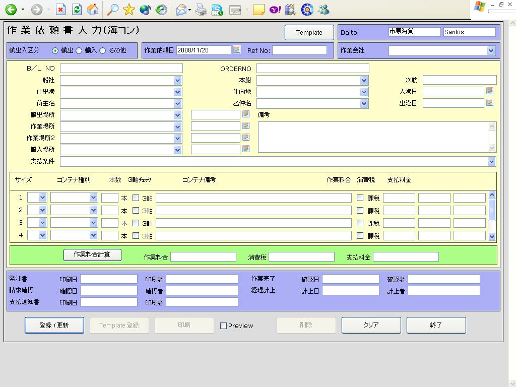
Firefox is my base browser when developing. Take a look at the upper right portion of the form, where there are 3 elements. They are supposed to be well aligned with the long textarea, long select element and the sub-contents. Since we are basing on IE6 as our main client browser, we need to based all our looks on IE.
Also notice the contents inside the sub-contents, the middle part, on the right. There is a big space between the last element and the border of the container. I did it so because of IE. Look at IE.
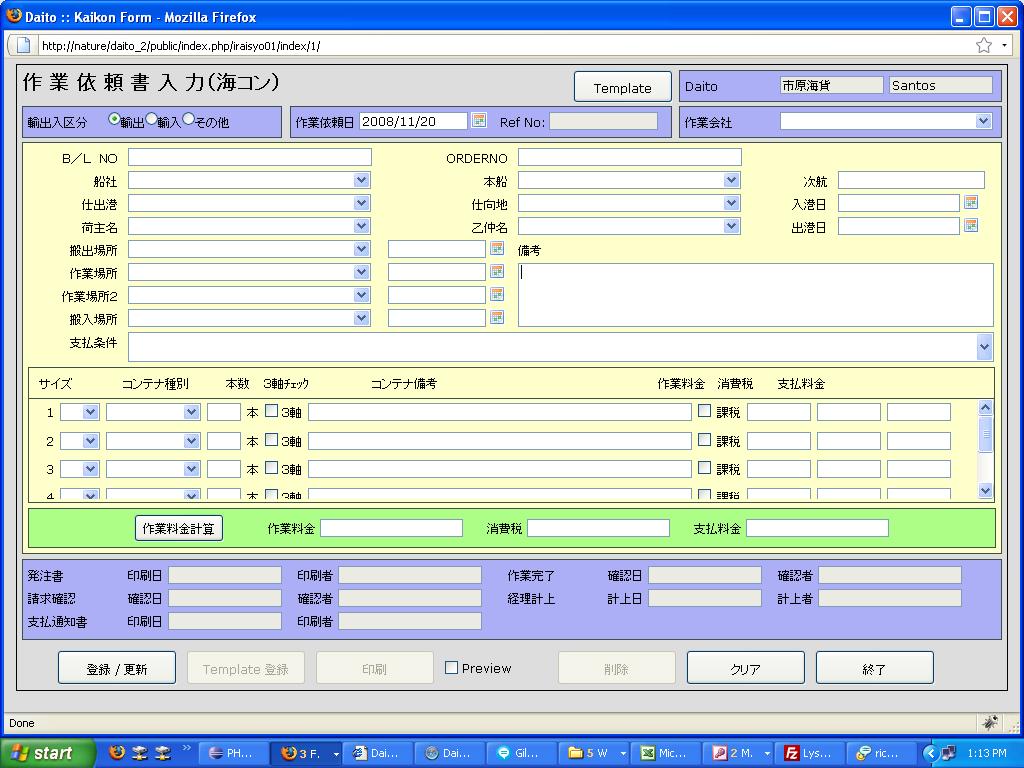
This is the IE6 screenshot. As you’ve noticed, everything is well placed, all aligned on where it should be aligned. However, when viewed on a standard browser, you will notice a little difference. Also notice the long select element: the height was not obyed in IE6, but in firefox, it was working fine. It must be double the height of ordinary select element.
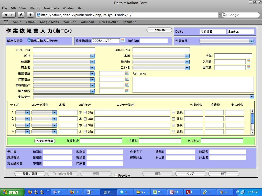
On Safari, it was almost as smooth as Firefox with few exceptions: The buttons. The height style of input buttons was not obeyed by Safari and also the height of select elements.
Why did I consider IE6 much compared to other?
Simple: The project requirement says that it most be built upon IE6. Therefore it must always look good in IE, and sacrifice some pixels on Firefox and Safari. Bottom line is: I get pwned by IE6.